

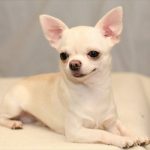
愛犬が、より健康的に暮らし長生きできるためのドッグフードの選び方を、紹介します。
最近のドッグフードは、国産も外国産でも、雑穀不使用(グレインフリー)が人気です。
しかし、
全犬種対応だったり、幼犬(子犬・パピー)・成犬用・シニア用のライフステージ別、
年齢別や○○犬専用の犬種別などと選択肢が多すぎます。
それに、
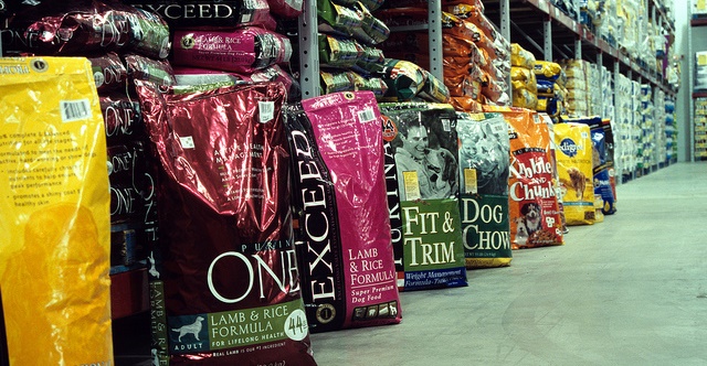
ショップに行ってもネットでも、値段やランクはまちまちで、原材料も様々。
同じような悩みを抱えている飼い主さんは、多いんです。
ネットのドッグフードランキングに惑わされることなく、
愛犬が長生きできるためのドッグフードの選び方について書いています。
1.安全なドッグフードメーカーかどうかを判断する方法は?
安全なドッグフードメーカーかどうかを判断するには、次の3つのポイント
「犬の体に悪影響のある原材料が使われていないか」
「フードの原産国がハッキリしているか」
「メーカーの考えは犬の方を向いているか」
を参考に、自分が共感できたフードを選ぶのが良いです。
①良い原材料を使ったドッグフードメーカーか見分けるポイントは?
ドッグフードの原材料の良し悪しを見分けるポイントは、
酸化防止剤や成分です。
酸化防止剤などは無添加であること
量産フードメーカーのドッグフードには、
多かれ少なかれ酸化防止剤は必ず含まれています。
犬の身体に良いと言われて、注目されているオメガ3,6脂肪酸も、
実は、光や空気や熱に大変弱く、袋をあけると一気に酸化が進みます。
その為に、
どうしても酸化防止剤がかかせません。

酸化防止剤には、いろんな種類があり、安全なドッグフードメーカーならば、
慎重に選んでいます。
しかし、
ドッグフードメーカーの中には、
ダイオキシン系の薬剤で発がん性が疑われるエトキシキンなどの酸化防止剤を、
使うところもあるのです。
エトキシキンは、環境省の定める「愛がん動物用飼料の安全性の確保に関する法律」には抵触はしていませんが、
原材料が安全な成分であること
最近は、ドッグフードの成分に配慮して、
穀物不使用を選ぶ飼い主さんが増えています。
しかし、
ドッグフードの成分に配慮する飼い主さんは少数派で、
日本は、まだまだ欧米諸国に遅れています。

例えば、
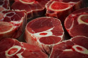
ドッグフードの成分での「鶏肉」と「チキンミール」について、
どれだけの飼い主さんが気にしているでしょうか?
「鶏肉」の場合なら、材料は生肉なのか、乾燥肉なのか。
当然、生肉の方が原価が高くなってしまうけど、
消化が苦手な愛犬なら、生肉の方がいいわけです。
また、
ブロイラーの頭部・脚部・内臓などの副生物を、
高温高圧でレンダリングしてできる「チキンミール」は、
決して危険なものではなく、犬にとっては安全でご馳走とも言える栄養源。
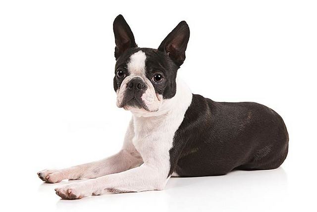
ドッグフードだけが原因ではありませんが、食物アレルギーや涙焼け、 腎臓病とドッグフードの関係は無縁ではありません。 犬の健康には、ハンガーストライキや早食いにも注意する必要もあります。 さらに、チワワ ... 続きを見る
【関連記事】
▼目的別ドッグフードまとめはこちら

目的別ドッグフードまとめ
②ホームセンターで売ってる安いフードメーカーは何故安全じゃないの?
ホームセンターのおすすめドッグフードは危ない
日本のメーカーでホームセンターで売ってる安いフードには、
犬の内臓への負担が大きな穀物が、多く入っているからです。
ドッグフードでは安くて良いものは期待できないよ
安いドックフードの原材料一覧の最初には、
必ずトウモロコシや小麦、大豆などの文字が並んでいます。

多量の穀物は、毛並み悪化や虚弱体質、アレルギーの原因とも言われます。
仮にも「総合栄養食」と呼ばれるものが、激安で購入出来るのは不思議ではないですか?
合成添加物も、○色○号などの着色料(タール色素)は、
腎臓障害やアレルギー、発がん性などの症状が出るとされているもの。
合成保存料として使用されているのソルビン酸カリウムも、動物実験で発がん性の疑いがあるのです。
③獣医さんやペットショップのおすすめなら信頼できるメーカー?
獣医さんやペットショップの勧めるフードなら安全・安心などと、鵜呑みにするのも危険です。

動物病院の獣医師は、療法食しか知らないと考えて良いでしょう。
犬の栄養学に明るい獣医師は、一握りです。
獣医師推奨の言葉に、だまされてはいけません。
④海外のフードメーカーなら基準が厳しく安全なドッグフードなの?
海外のフードは基準が厳しく、日本より安全性は高いです。

イギリスには、犬用と記載された生肉が売っているくらい、ペットも生きる権利を与えられています。
だから、
海外のフードは値段はそれなりにしますが、
毛艶、身体の状態や排泄は素晴らしく良いです。
外国産ドッグフードをまとめて紹介します。 【アメリカ産】オリジン、アーテミス、Wag、サイエンスダイエット、プロパック、ウェルネス、プリンシプル、ピナクル、ハロー、ユーカヌバ、シュプレモ、ANF 【カ ... 続きを見る
【関連記事】
▼外国産ドッグフードの評判まとめはこちら
外国産ドッグフードの評判まとめ
⑤本当に良いドッグフードを一言で言うと?
良いフードとは、ウンチの状態、毛艶などの健康状態が良好であるフード。

犬には個体差があります。
たとえ同じフードを与えても体質などが違う為、
同じ安全なメーカーのフードをあたえても、あうあわないがあります。
形と硬さが良い便り(便)が届くものが、良いフードです。
「力み過ぎずに出せて、跡を残さず、そしてキッカブル」が、
理想的なウンチだそうです。
キッカブル(Kickable)は、蹴り飛ばすことができるという意味で、
柔らかすぎずに、蹴ることもできる固さだってことです。
(蹴りたくはありませんが( ゚Д゚))
このウンチの質を観察することが、
飼い主にとっては何よりも大事なわけです。
⑥フードのお試しを請求するとメーカーからしつこく勧誘されないか?
安全で良心的なメーカーのお試しフードなら、
電話がかかってきても、犬の調子を尋ねられるくらいで、
購入をしつこく勧めらることもありません。
逆に、
何故安全なのかを、丁寧に教えてくれたりします。
大量生産で安売りされている総合栄養食フードとは何が違うかを、聞けますよ。
サンプル品を数回食べさせたからと、すぐに分かるものでもありません。
愛犬にあった安全なフードを選ぶ為には、最低でも1ヵ月与えて観察する事も重要です。
安全なドッグフードってヒューマングレードじゃなきゃだめという訳ではありませんが、 評判の悪いドッグフードには理由があります。 もちろん、安いドッグフードでも長生きする犬もいます。 ペットショップがおす ... 続きを見る
【関連記事】
▼ドッグフードの安全性まとめはこちら

ドッグフードの安全性まとめ
2.評判が良くてもフードの原材料・成分でごまかされない方法

犬は家族であり、一緒に生活する人生の伴侶です。
そんなワンちゃんに合うドックフードを、見つけてあげたいですね。
でも、現実は、ドックフード難民になる飼い主さんが多いのも事実なんです。
①安いドッグフードと高いドッグフードの違いは?
ドッグフードは、高いから必ず良いフードとはなりません(激安フードは論外ですが)。
ドッグフードは評判だけで選んではいけない
ドックフードのランクは、口コミ・レビューの評判や意見ではなく、
袋裏の成分表をしっかり見て判断しましょう。
値段ばかりを気にして、中身を見ないなんてことにならないようにしてください。
成分表(原材料一覧)というのは、原材料が多い順に並びます。
ただし、
”肉類”とだけ書かれているランクのものは、避けてください。
ココがポイント
例えば、"チキン"や"ラム"と言った具体的な名前が書いてある方がいい。
生物学的に、犬は非常に少ない量の炭水化物しか必要としない肉食動物です。
犬の祖先は、野生のオオカミなのはご存じでしょう。
私たちの家族である犬って、オオカミと全く同じ消化器を持っているんです。
つまり、
犬の消化器って、短く出来ているわけ。
それは、
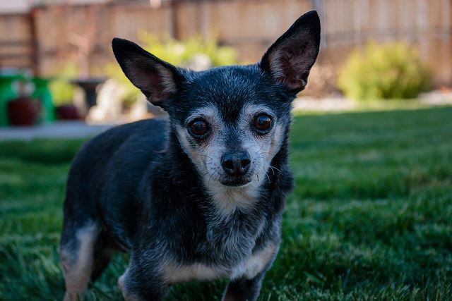
ドッグフードトラブルが多い犬に、チワワやダックス、柴犬がいます。 そんな犬専用のドッグフードも、市販で見かけますが、 犬種別ドッグフードの評判をまとめて紹介します。 チワワやダックスの小 ... 続きを見る
【関連記事】
▼犬種別ドッグフードの評判まとめはこちら
犬種別ドッグフードの評判まとめ
肉をふんだんに使っているような表示のドッグフードなら良いの?
肉類でも、量的にふんだんに使えばいいという訳ではありません!
例えば、
原材料表示に ”○○肉副産物”とか ”○○ミール”と表記されてるランクのドッグフードってありますね。
代表的なのは、チキンミールですが、一概には悪い材料ではありません。
良くないのは、低品質な鶏肉粉であるチキンパウダーです。
これらの”○○肉副産物”とか ”○○ミール”の区別が苦手な飼い主さんは、
避けた方が無難かもしれません。
避けたほうが無難なことには理由があります
避けたほうがよい理由
これらは、すべて肉や赤身は入っておらず、動物の肺、肝臓、腎臓、胃、腸、血液、骨や頭などが、主原料です。
ミールでも、たんぱく質や栄養素はありますが、鮮度は低いと考えるべきです。
さらに、粗悪なランクのドッグフードでは、内臓に含まれたままの糞尿や屍、羽、鱗などを加工したものも含まれているのですから。
畜肉4Dとは具体的にどんな肉?
畜肉4Dとは
肉副産物というのは、これら4Dの肉を含む可能性のある肉のこと。
さらに、”動物性油脂”、”家畜脂肪”など、品質が不明で低いランクレベルの油もあります。
これらは、粗悪フードの根源ともいわれる原料です。
「動物性油脂」は、レストランなどから廃棄された油が原料とも言われているくらい。
低品質なランクの原料だと、涙やけや食物アレルギーを発症する可能性があると言われています。
毎日の健康ケアには、原料の徹底した品質管理が大切ですね。
フードの記載表示は
口コミや評判だけに頼らない!
具体的に、原材料別について良い悪いを知る
ここから、原材料毎ごとにお話します。
穀類はドッグフードに必要でしょうか?
穀類は、ドッグフードに絶対必要なものではありません。
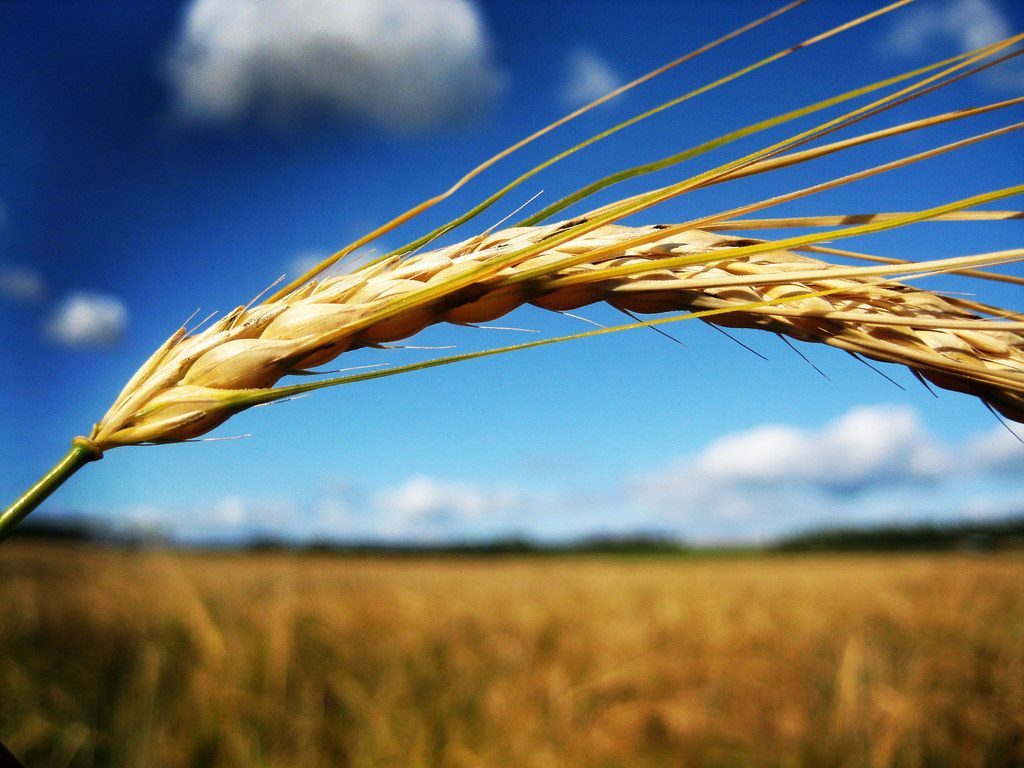
穀類とは、とうもろこし、小麦粉、脱脂米糠、コーングルテンフィード、オートミールなど。
最近は、栄養価の高い全粒大麦・全粒玄米を、原料として使うドッグフードも多くなってきています。
しかし、
犬には、穀物を消化する消化酵素が備わっていません。
そのため、
穀物がメインのごはんは、犬にとって消化が困難なもの。
穀物=絶対ダメという訳ではありませんが、消化に苦労してるのは事実。
ココがポイント
穀物は、犬の消化器官に負担がかかってしまうのです。
また、
我が家の愛犬のように、便秘や肥満、毛艶の悪化を引き起こす原因ともなります。
愛犬が穀物が多いフードを食べたらどうなるの?
今まで穀物フリーのドッグフードばかり食べていた犬に、穀物・炭水化物の割合が上位を占めているフードを、
急に与えない方がいいです。

犬が、消化の仕組みの違いや、品質の違いに身体がついていけず、
炭水化物は、ペットの健康維持と関わりがあるのでしょうか?
ココに注意
従来より、炭水化物の過剰摂取は、ペットの健康維持と深い関わりがあると言われています。
穀物は、炭水化物としても栄養価は低いもの。
犬は、穀物をベースにした食事をすることはできますが、穀物は犬の主食ではありません。
しかも、早期に栄養バランスを崩してしまうのです。

穀物に含まれるグルテンなどが原因で、お腹を壊してしまうワンちゃんもいるくらい。
愛犬が体調維持するためには、適正体重をキープすることも大切。
それにもかかわらず、市販されているペットフードには、
40%から70%も含有されているフードもあるのです。
こんなに多く食べさせては、愛犬の炭水化物の必要摂取量を超えてしまい、
ドックフードの増量、いわゆるカサ増しという役割りの為に、
安価な小麦粉などの炭水化物を使用してあるフードもあります。
例えば、
コーンミールは、トウモロコシの芯などのカスです。
ただし、便通でウンチを固める効果だけはあるようです。
そのためだけに、多くのドッグフードに入っているのも事実です。、
穀物不使用のドッグフードは、値段が高いのではないでしょうか?
値段的には、穀物不使用では、高いドッグフードになりがちです。

しかし、
市販されているドッグフードの中でも探せば、穀物不使用フードでも価格が手頃なものもあります。
だから、
穀類まとめ
オオカミから進化した犬は、穀物を消化するのが苦手なため、 穀物不使用のグレインフリードッグフードが適していると注目されています。 併せて、グレインフリーのドッグフードと生肉を一緒に食べると、犬の消化を ... 続きを見る
【関連記事】
▼グレインフリードッグフードの評判まとめはこちら

グレインフリードッグフードの評判まとめ
豆類(脱脂大豆、大豆粉末)はドックフードに必要ですか?
これらは、ドックフードを立派なタンパク含有フードにする、一つの原材料なので必要です。

タンパク質の含有率が高いからといって、ひとつも生肉を使ってないドッグフードもあります。
原材料に、脱脂大豆、それにプロテインやたんぱく質を入れているだけです。
脱脂大豆って、いわば産業廃棄物。
プロテインやたんぱく質は、安価な小麦から化学的に抽出したものです。
その他、大豆ミールも大豆のカスですが、使用されます。
昔から使われるオカラならば、これも豆腐の絞りカスですが、
ダイエットにはいいかもしれません。
サツマイモは、ドッグフードに入っていても大丈夫でしょうか?
サツマイモは、ドッグフードに入っていても大丈夫です。
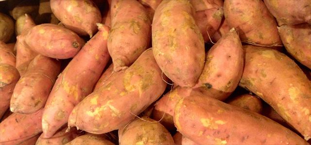
人間のダイエットでも知られていますね。
サツマイモは、食物繊維が豊富で、少量であれば整腸作用はもちろん
腸内環境の改善のために良いです。
また、
それに、
腹持ちが良いというメリットもありますね。
一方、
サツマイモには、炭水化物が含まれます。
実は、お米と同じくらい多く含まれている。
使われなかった分は、体内で糖分として認識されるんです。
ココに注意
炭水化物は、体内脂肪として蓄積される。
糖尿病、肥満の原因にもなり得るので、食べさせ過ぎには注意してください。
ビートパルプはドッグフードに入っていても大丈夫でしょうか?
ビートパルプは、ドッグフードに入っていない方がいいです。
ビートパルプは、砂糖大根の砂糖のしぼりかす。
ビートパルプは、硫酸系の薬品を使って抽出されます。
くちばしや爪はドッグフードに入っていても大丈夫ですか?
くちばしや爪は、ドッグフードに入っていても大丈夫なのです。
これらは、ワンちゃんにとって悪い物ではありません。
見た目が、白いプラスチックの様に見えるからかも。
犬は、肉食寄りの雑食です。
だから、消化・吸収にも問題ないのです。
消化性に優れているので、毛並みもつややかに。
なお、
鶏がらは「鶏の肋骨」なので、鶏骨と同じランクです。
ワンコが、骨を平気で食べるのは、人間より消化能力が高いためです。
一方、
犬の歯の構造は、咀嚼(かみつぶす)するようにはできていません。
ただ、呑み込めるように引き裂くだけ。
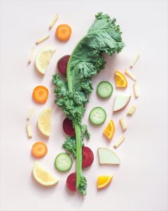
野菜はドッグフードに入っていても大丈夫でしょうか?
野菜は、ドッグフードに入っていても大丈夫ですが、消化の点ではよくないです。

犬は、腸が短く、野菜類の消化は、苦手で得意ではないのです。
人間ならば、野菜や果物を上手に食事することができるのに。
これも、意外ですね。
そして、たとえ犬が上手に食事することができたとしても、
野菜の栄養を、全て利用できるわけでもないのです。
しかし、
お肉と野菜は一緒に与えた方がよいでのでしょうか?
お肉と野菜は、一緒に与えた方がよいです。
例えば、
食材としてのササミは、リンを多く含みます。
この時、
カルシウムも一緒に与えた方がいいのです。
ただし、
カルシウムとシュウ酸は、尿管結石の原因にもなり得るもの。
そのためは、
過剰摂取しないように管理してあげることが、大切。
それだけで、不要な病気にかからなくてすむのです。
シュウ酸って、野菜のアクですね。
イモ類、白菜、ごぼう、小松菜やほうれん草などにも、シュウ酸は含まれています。
だから、
野菜は、刻んで水にさらして、アク(シュウ酸)を抜いてから使ってください。
野菜は、どのくらいが適量でしょうか?
これは、犬の育ってきた環境や個体差が大きいので、
愛犬の体に無理のない適量を、自分で見極めることが大切です。
つまり、
飼い主が、愛犬のウンチを毎回チェックして、判断するのが一番良い。
野菜が得意な犬もいるし、ほんの少量の野菜で便が緩む犬もいるから。
アレルギー反応が出にくい肉には何がありますか?
ラム肉やベニソン(鹿肉)・フィッシュ(魚肉)・馬肉が、
アレルギー反応が出にくいとされ、口コミでは評価が高いです。
一般的に馴染みが多い乳製品・大豆・ビーフ(牛肉)・ポーク(豚肉)などより、
ずっと出にくいんです。
ココがポイント
肉に、アレルゲンとなりやすいものが、入っていないことも大切です。
また、
運動不足になりがちな室内飼いの犬にとっては、散歩での運動量・カロリー管理も大切。
そんな、肥満気味の犬にも最適です。
ラム肉だけで、理想的な体型を維持できてる子も。
そのため、ラム肉がブレンドされているドッグフードも多いんです。
でも、
ワンちゃんにもそれぞれ好みがありますね。
すべての愛犬に合うドッグフードって、この世に存在しません。
牛よりラム肉がいいからと言って、嫌がるのを無理に与えるのは逆効果。
アレルギー予防のためドッグフードをローテーションするには、どんな注意が必要でしょうか?

『穀物は、犬にとって不自然な食材であり健康に被害を及ぼす』と、専門専門機関は報告しています。
2008年に、アメリカ飼料検査協会(AAFCO)は、「犬と猫が必要とする炭水化物の最低量はゼロである一方、たんぱく質は過剰供給になることはない。」と発表しています。
特に、
植物油はドッグフードには必要でしょうか?
植物油はドッグフードには必要ではありません。
植物油自体には、コレステロールの低下や、動脈硬化の予防等の良い働きがあります。
しかし、
これも過剰摂取すれば、逆に動脈硬化・高血圧等を招くのです。
だから、
植物油には、種類ごとに特徴があります。
植物油の特徴
この中で、近年注目されているのが、n-3系脂肪酸。
魚に含まれる事で有名なDHAやEPAにも、多く含まれています。
n-3系脂肪酸は、体に良いと話題のオメガ3脂肪酸やn-6系脂肪酸などの不飽和脂肪酸とのバランスのため、とても大事な栄養素です。
また、
亜麻仁油には、人間用と犬用がありますが、これらにたいした違いはないのです。
両者は、原材料を見ても同じで、犬用ってだけで何故か高い。
ダイジェストはドッグフードに入っていても大丈夫なのですか?
ダイジェストがドッグフードに入っていたら、要注意です。
ドッグフードにとって、「喰いつき」は、確かに欠かせない要素のひとつですね。

でも、
ダイジェストは、好き嫌いが多いワンちゃんでも、ご飯の喰いつきをアップするために、
嗜好性が強い香りをつけるだけのものです。
このダイジェストを、ドライフードの表面にスプレー処理します。
当然、栄養的には価値がないもの(T_T)
例えば、
チキンダイジェスト(鶏加水分解物)は、鶏肉(骨抜き)の脂肪を元に、
化学処理あるいは酵素による加水分解により作られます。
防腐剤で加工済とはいえ、脂肪分なので空気に触れると酸化しやすい状態。
酸化してしまったドッグフードは最悪で、愛犬が食べない可能性も。
酸化防止するには、
防腐剤の代わりに、天然由来のビタミンを使っているフードなら、なおさらですよ。
激安ドックフード
ピーナッツの殻がドッグフードに入っている必要はあるのですか?
ピーナッツの殻はドッグフードに入っている必要は、まったくありません。

これも、ワンちゃんにとって、なんの栄養価もないもの。
飼い主が、ティッシュ等で、ワンちゃんのうんちの処理をしやすいようにするための原材料です。
愛犬の便が綺麗な形で、安定させるにはいいでしょうが(T_T)
ウンチを、感動するくらいコロコロにしておくためだけに、ピーナッツの殻を粉砕して入れているのです。
ワンコの食物禁忌について絶対覚えておくことは?
ワンコの食物禁忌について、知っておかないと可愛い愛犬を失うことになります!
ワンコの食物禁忌に該当する食物は、主に次のもの。
だから、
例えば、
せん餅には、マネギやエビが含まれているものもあるので、
欲しがっても分けてあげてはいけないのです。
誤食させると、砂糖でさえも、多いと下痢や嘔吐といった形で何かしらサインが出てきます。
犬に塩分は本当にご法度なのでしょうか?
犬にとって、塩分はご法度ではなく、少量ですが必要です。
以前、アルシャー京子さんのブログで、「塩分と犬」という題で書かれていました。
それによると、
犬にとって塩分とは本当に悪者じゃなく、食事で摂取すべきだそうです。
犬は人間と違って汗を掻く部分が少ないことから、
塩分をほとんど必要としないと言われてきたことが、いつの間にか
「食餌中の塩分はご法度!!」と誤解されてしまっている。
犬だって、足の裏や腋の下などには汗腺があるから、
運動をすれば当然ながら汗を掻くのが真実。
もちろん、人間の食事には大量の塩分が含まれているため、
だから、
ドッグフードにも少なからずナトリウムが含有されているけど、
大手メーカーでは自主的に表示している一方で、それ以外のフードでは表示がないのが実際。
私たちが、愛犬のために、手作り食を作る時にも、
しっかりナトリウムの量を、自分で計算して出す必要があるのです。
飼い主さんとしてチェックするポイントは、2つ。
1つ目としては、
なめる時は、塩分不足の兆候らしい。
2つ目としては、
犬が下痢や嘔吐した場合には、塩分が不足気味となるので、
下痢や嘔吐の後にしっかり塩分補給をしてあげること。
どうやら、犬にとって、塩分は少なければ少ないほど良い、
というものではないようです。
例えば、最近では、塩分を薄くしてあげることは、
たいていの飼い主さんはご存知でしょう。
塩分が多い煮干しなんか、昔はよくあげてましたね。
煮干しは、適度に摂る分には良い食材です。
ですが、
手作りフードにすべきか迷っているなら、評判のオーブンベイクド製法のドッグフードが1番です。 しかし、 ドッグフードの手作りは、食物アレルギー判別も一緒にできるメリットもあるのです。 ただし、 手作りご ... 続きを見る
【関連記事】
▼ドッグフードの手作りまとめはこちら

ドッグフードの手作りまとめ
添加物には、どんなものが含まれるかご存じでしょうか?
添加物としては、着色料・香料・酸化防止剤の3つ以外にも、
アミノ酸・ビタミン・ミネラル類も含まれます。
例えば、
ドッグフードを選ぶ基準に、ウンチのニオイが、あまり臭くないことをあげる人がいます。
特に、
室内犬がウンチした時に、人間にとってにおいが臭くない方がいいのは、理解できますね。
でも、
ココに注意
ニオイを少なくするために、ドッグフードに、危険な添加物を複数も混入させているのです。
こんなドックフードが、ワンちゃんにとって良いわけがありません。
愛犬の体に悪影響を及ぼし、病気のリスクが高くなるだけ。
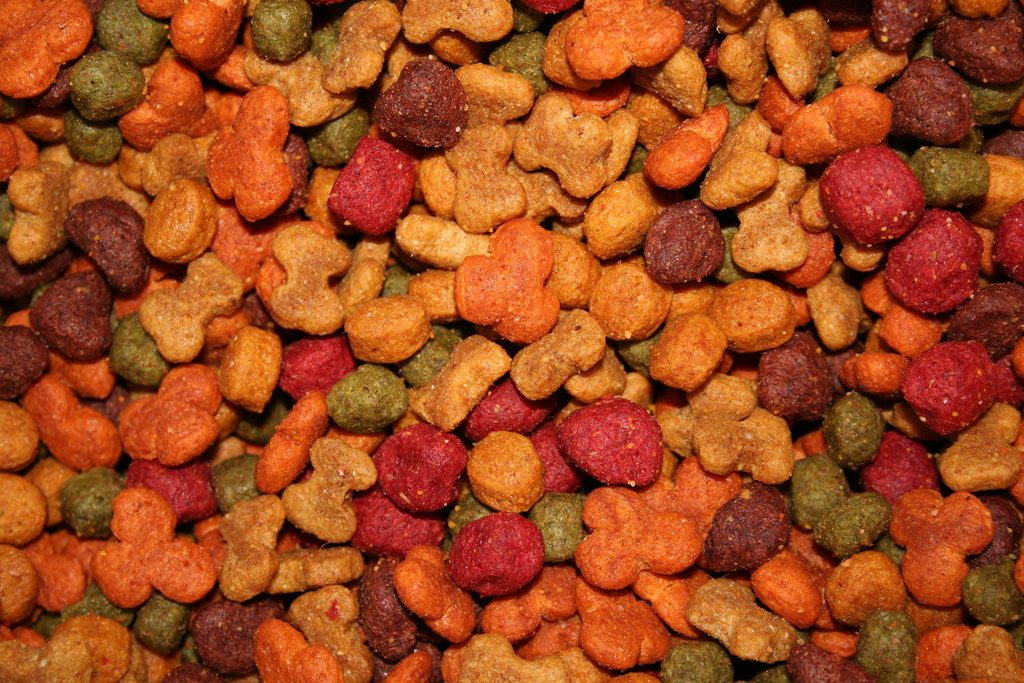
着色料は何のために含まれているかご存じでしょうか?
着色料を使うのは、実は人間のためなのです。
犬って、人間ほど色を区別できないので、視覚では味わえません。
でも、美味しそうな味のドッグフードに、飼い主が見えるからというだけの理由で、
着色料が配合されています。
驚きです。
つまり、
これは、ドッグフードメーカーが、犬のほうを向いてくれてない事実です。
実際には、
ドッグフードの着色料として、
二酸化チタン、食用赤色102号、食用赤色106号、食用黄色4号、食用黄色5号、食用青色1号
などが使用されています。
なかでも、食用赤色102号は、カナダ、ベルギー、アメリカなどでは、
人間用食品への使用を禁止されているものなんです!

また、
最近では、オーガニックとか自然派を謳ってるドッグフードもあります。
その様なドッグフードは、例えば、ローズマリー抽出物を着色料として使用していることを前面に出していたりします。
しかし、
ローズマリーには、石油タール色素もあります。
これは、エタノール・アセトン・メタノールなどの溶媒を使って抽出されているもの。
この石油タール色素は、発がん性物質や染色体異常の恐れもあり、
アレルギーや遺伝毒性などを引き起こすことなどが確認されているんです。
もちろん、多少食べたくらいでは、直ぐに症状が出るわけでありませんが。
しかし、
普段から毎日食べさせることで、確実に身体の中に蓄積されて行きますね。
そのうちに、皮膚が赤くなり、痒みが酷くなる犬も。
酸化防止剤って使って当たり前なのでしょうか?
残念ながら、ドッグフードの世界では、当たり前の様に使用されています。
酸化防止剤といっても、いろんな種類がありますね。
なかでも、亜硝酸ナトリウムなどの化学素材のランクは避けてください。
一方、
植物由来のミックストコフェロールなどのランクは大丈夫です。
例えば、
半生タイプのドッグフード(ウェットフード)は、水分が多く、
肉や野菜を原料にしているため、保存期間が短く劣化しやすいもの。
だから、
腐らないように、酸化防止剤がたっぷり。
正確に言うと、
防腐剤的なPH調整剤などの添加物が、混入されています。
一方、
ホームセンターなどに置いてある安いランクのドッグフードは、長期間持つように作られている。
酸化防止剤
アミノ酸はドッグフードに入っていちゃいけないの?
添加物としてのアミノ酸がドッグフードに入っているのは、不自然なのです。

あなたは、アミノ酸は添加物なの?と、不思議かもしれませんね。
実は、
安いドッグフードって、肉の量が不足しているために、
わざわざアミノ酸を添加しなければいけないんです。
特に、
リジン・メチオニンと言ったアミノ酸が添加されているドッグフードは、要注意。
ビタミン・ミネラル類ならドッグフードに添加されていても大丈夫ですよね?
ビタミン・ミネラル類が添加されていドッグフードは、なるべく避けてください。
加工上、ドックフードをドライにするには、150~160℃の熱処理加工過程が必要です。
しかし、
食物に含まれる多くの酵素とビタミン・ミネラルは、
46℃以上の熱では破壊されてしまうんです。
一方、
破壊されない様に、加熱処理で低温製法にする方法をうたっているメーカーもあります。
しかし、
調理工程での低温製法の温度は、メーカーごとにまちまち。
135℃だったり55℃だったり、かなりの差が。
最近は、従来よりも確かに低い温度で作られてます。
しかし、46℃以上の熱で破壊されることには変わりないです。
結局、
従来製法とそれほど大きな違いはありません。、
おすすめするのは、
安全安心な添加物ってないの?
安全と品質を保証する添加物はありません。

引用元:環境省ホームページ
しかし、原材料に含まれる添加物成分の表示までは義務付けていません。
原材料に含まれる添加物については、
「愛がん動物用飼料の成分規格等に関する省令」
で限度量が規定されています。
例えば、
エトキシン・BHA・BHTについては、合計で150ppm以下、このうちエトキシンは75ppm以下です。
例えば、
人には禁止されているアフラトキシンB1やメタミドホス。
これらは、ドックフードには使用しても良い添加物なのです。
現状、安全と品質を保証する統一規格はないのです。
もちろん、
添加物が多い安いランクのドッグフードを一時期食べても、通常量なら全然問題は出ませんよ。
しかし、
例えば、
早く太らせて大きくするために、ホルモン成長剤を投薬した鳥肉や豚肉もあります。
これらの肉主体のドッグフードを、食事として与えることもあるでしょう。
それても、愛犬には体調不良や不満をを申し立てることができないのですよ。
だから、
スーパーによく売ってる、粒が柔らかいタイプのドッグフードは、
カリカリとした硬いフードとは比べ物にならないくらい添加物が多いので、

添加物の怖さでは、
アメリカに輸出された中国加工のドッグフード事件
を記憶している方も多いと思います。
そのドッグフードで、大量のワンちゃんが死亡しましたね。
では、
安いドッグフードではなく、最近はやりのプレミアムフードであればいいのでしょうか?
実は、残念なことに、
プレミアムランクでさえも、結局似たような添加物が入ってるものもあります。
②プレミアムドッグフードは、ヒューマングレードの原材料を使っているの?
Sランクのプレミアムドッグフードなら、 国産でもヒューマングレードの原材料を使っています。
最近は、
ドッグフードの中でも質の良いものを「プレミアムドッグフード」と呼ばれていますね。
プレミアムドッグフードとは?
添加物を必要最小限にとどめたドッグフードのことを指します。
しかし、
それを客観的に定義ランク付けしている公正な機関はありません。
もちろん、
一般的なドッグフードよりも3倍ほど値段が高めの高級品です(T_T)
さすがに、価格はプレミアムな高さになっています(最低でも1kgあたり2000円以上と高価!)。
”購入”については、お財布との相談になりそうですね。
私なら、経済的な理由から、継続購入が難しくなることもありそうです。
しかし、
プレミアムフードはどれも安くはないですが、
もちろん、
安全性にも不安がない、最高レベルのヒューマングレードという、
こだわりの原材料や成分を使っているわけですから、愛犬の健康にもベストです。
プレミアムドッグフードは、ペットの筋肉や体を維持し、全体的な健康をサポートするために、
最高品質の素材のみを使っています。
そのうえ、
動物性タンパク源を豊富に含み、
原材料表示に”肉副産物”などと言うあいまいな表示をしているフードなんてない。
ただし、
かかりつけの動物病院の獣医さんから、お試しにプレミアムフードを勧められることがあると思います。
この場合、
基本的に獣医さんは病気に詳しくても、ドッグフードの基礎知識はないと言っても過言ではないので、
プレミアムフードにも種類があるけどどれでもいいの?
プレミアムフードにも種類が多いですが、どれでもいいわけではありません。
日本のドッグフード関係機関として、唯一「ペットフード公正取引協議会」があります。
しかし、
これは、景品表示法に関する業界の任意団体なので、
日本でプレミアムランクと言っても、
抗生物質やホルモン剤を投与しないで飼育された肉を豊富に用いている程度です。
もちろん、
農薬など一切使用していないオーガニック野菜など、
人間が食事として摂れるレベルの原材料を使っているフードもあります。
実は、世界的に見て、
現状では、
プレミアムフードだけにこだわる必要はなさそうです。
プレミアムフード
口コミや評判じゃなくて、あくまで原材料を見て判断しなくちゃね。
③安全な市販のドッグフードを選ぶために飼い主さんができること
まず、
どんな愛犬にも合うドッグフードはありません。

安い発泡ドッグフードが水に浮かぶことを利用して、
水に浮かんだり沈んだりすることで、ドッグフードの良し悪しをチェックする人もいます。
しかし、
その比較検討事態は、意味がありません。
ワンちゃんにも、体質や好き嫌いなどがあります。
だから、
ですが、
スーパーで売っている肉だって、値段の差でランクは歴然ですよね。
ドッグフードでも、国内の有名ブランド肉と人間の食品基準が通らない捨て肉では、
コストがまったく異なることは理解できると思います。
美味しい市販のドッグフードには怖い仕掛けがある
愛犬の体質もわからないまま、特定のドッグフードを良いもの悪いものと断言するのは危険です。

また、
それに、
食欲を出させるため、ダイジェストみたいな動物性脂肪を多量に加えたフードが売られているんですから。
結局、
愛犬が消化不良になって、またドッグフードを変えるだけ。
安全で健康の為に、何を選択するのか決めるのは、
ワンちゃんではなく飼い主さんです。
愛犬ちゃんがいつまでも元気で過ごせるために、
3.ペット先進国の外国産ドッグフードでも注意して選ぶべき4つのポイント
ドッグフード選びは大変迷いますよね。
ドッグフードに関しては、
と聞いたことがあると思います。
私達人間の食事でも、中国産を避けて、国産だと安心しますよね。
ドッグフードについても、中国産は論外でしょうが、同じことです。
しかし、
原産国表示を見れば、フードの製造国を判断できるの?
残念ながら、原産国表示だけでは判断できません。
原産国表示は、最終加工をした場所を示すだけです。
ペットフードの製造においては、
たとえば、
日本国内の工場で最終加工したならば、「原産国名:日本」とか「国産」
が、ドッグフードに表示されています。
その場合、
中間加工の工場が、中国でないかは重要です。
そのうえ、
国産表示されていても、原材料でお肉の産地が中国やタイでないかも重要です。
原産国名
②日本と海外では、どれほどペットの扱いが違うかご存じですか?
日本と海外のペット先進国では、ペットや飼い主に対する制度がとても違います!

日本では、あるフードを食べ続けて健康を害しても、
フードとの因果関係を、追及出来ないのが現状です。
つまり、社会の背景として、
そんな感じに、外国からは見られているようです。
それに対し、
イギリスは「動物愛護の先進国」といわれている国だけはあります。
例えば、
イギリスやドイツの飼い主さんは、ペットショップではなくブリーダーから、ワンちゃんを購入することが多い。
購入するためには、
ワンちゃんに対して、どれだけの基礎知識が飼い主にあるのかの審査もあります。
また、
ドイツでは、ワンちゃんを飼うには、毎年犬税がかかります。
そのため、
日本の様に安易に飼う人が少ないのです。
国産ドッグフードと外国産ドッグフードには、決定的な品質の違いがありますが、 『プリモ』『ドットわん』は期待以上に良かったフードでした。 それに対し、『ナチュロル』は残念な評判のドッグフードでした。 ま ... 続きを見る
【関連記事】
▼国産ドッグフードの評判まとめはこちら
国産ドッグフードの評判まとめ
③ドッグフードを評価する専門雑誌があるってご存知ですか?
ペット産業先進国のアメリカには、
なんとドッグフードを評価する専門雑誌があるのです(^^)/

安全なドッグフードを市販で買えるための専門ランキングがある
海外ブランドのドッグフードにとって、高品質であると評価される背景が、日本とは違います。
例えば、
アメリカ国内で製造されるドッグフードについては、
という専門雑誌や専門HPがあります。
アメリカでは、専門雑誌や専門HPで高いランク評価を受けていることが、現地のドッグフードには必須です。
評価が低ければ、
ドッグフードとして品質が良いとは認められない!
という、社会のコンセンサスがあるんですね。
また、こちらの雑誌も有名です。
特に、
このWDJは、広告を一切掲載しない運営方針のため、第三者的な中立の立場でドッグフードを評価している雑誌です。
そのため、
アメリカでこれら雑誌のランク評価の信頼度はかなり高いようです。
ただし、
WDJの推奨ドッグフードの選定(Approved Dry Foods)は、商品のラベルの記載内容に基づいた評価によるもの。
実際に工場や原料を調査し、ドッグフード自体を分析評価したりしてるわけではありません。
でも、

主なWDJ基準としては、下記8つがあります。
一方、
Dog Food Analysisの方は、分析解析した結果を、ドライフードと缶詰フードに分けて、
各々六つ星から一つ星の星の数でランク付けしてあります。
六つ星が、一番良い評価ランクです。
評価理由を、良い点(pros:)と悪い点(cons:)に分けて書かれてあり、
見た感じ分かりやすいと思います(^^)/
日本に輸入されているドッグフードも載っているので、
④外国ドッグフードは正規品と並行輸入品では差はないの?
外国ドッグフードは、正規品と並行輸入品では差がとても大きいです。
日本語表示の正規品フードを選びましょう。

理由を理解するために、2007年3月にアメリカで起きた、
中国産メラミン混入事件を、再度詳しく振り返りましょう。
ドッグフードの成分表に表示されていない中国産有害物質(メラミン)が、
タンパク質量の水増しのため、意図的に混入されていたのです。
そのドッグフードが原因となって、
多数の犬や猫が死亡し、リコールされ訴訟にもなりました。
そして、
その年の6月には、同じペットフードが、日本でも輸入販売されていたことが判明したのです。
この事件を契機に、
「ドッグフードは危険性が高い」というイメージが浸透しました。
日本は、この事件を機に、
「ペットフード安全法〈愛玩動物用飼料の製造・販売にかかる基準・規格に関する法律〉」
を、2009年に施行しました。
この法律では、
を義務付けています。
販売業者、製造業者、輸入業者の全てが対象です。
この法律のおかげで、私たち飼い主が、明確に恩恵にあずかれる事が一つ。
外国製フードを選ぶ場合には、
この法律のおかげで、英語表示の物は正規品ではないということがわかってしまうのです。
つまり、
信用性に欠けるランクのフードを、間違って買わないで済むメリットが得られるわけです。

また、
ドッグフードの輸入経路には、並行輸入と正規輸入という大きく2つのルートがあります。
ココに注意
ドックフードは、温度や湿度などの環境によって、品質ランクが大きく変化するので、輸送中の保存方法に注意が必要です。
特に、
オイル分が多い海外のドッグフードでは、一番ヤバイ肉類の酸化に差が出ます。
正規品と平行輸入品の差
これでは、
また、
パッケージの強度についても差があり、トラブルの元です。
正規輸入品の方が、並行輸入品よりもずっと販売価格が高くなる理由がここにあるわけです。
しかし、
つまり、
輸入されるドッグフードって、日本特有の気候と生活環境に合わせて作られる必要があるわけです。
なお、
問屋・小売店にまで来てまとめられたドッグフードは、
国産品の方が好印象ですが、実はその先は同じなので差はありません。
また、
ドッグフードについては、質問などの問い合わせサポートがしっかりしているかも重要なところ。
そのため、
専門家が電話相談に対応する配慮ができるメーカーを選びましょう。

また、
飼い主さんには、賞味期限等を確認して与えることをお願いします。
実は、日本製、外国製に関わらず、
ドッグフードは、賞味期限ギリギリまで食べさせても大丈夫です。
ただし、
賞味期限は開封しない状態での賞味期限ですから、
外国産ドッグフード
・日本語シールの並行輸入品はNG。
激安ドッグフードから高級な高いドッグフードまで、その差は大きいけど、 愛犬にとって良いドッグフードは、アメリカのドッグフードのランキングを参考に、 生産国をチェックして選びます。 初めて子犬にドッグフ ... 続きを見る
【関連記事】
▼ドッグフードのABCまとめはこちら
ドッグフードのABCまとめ
4.愛犬におすすめの国産・無添加ドッグフードを見つける方法
①何故、海外製フードを選んでしまうのでしょうか?
法規制が緩い国産に対して、海外製ドッグフードは法規制がしっかりしているため、
安心できるからを選んでしまうんです。
国産ドッグフードと言っても安全性は約束されていない?
国産で安いドッグフードでよくあるのが、
〇〇ミールとか〇〇パウダーなどの副産物を使っていることは、先にお話ししましたね。
このような原材料を使用しているドッグフードは、残念なことに
消化不良を起こしやすい麦穀類を一番多く使っていることが多いです。
それに、
○○グルテンや○○プロテインとか人工的な加工原料も、犬には危険です。
理由は、安全管理が甘い中国や新興国では、これらグルテンやプロテインを
化学薬品のプールに浸して抽出していることも多いためです。
日本に「ペットフード安全法」が出来たと言っても、
まだまだ、海外製ドッグフードに比べると甘い面があります。
つまり、
②そうは言っても国産ドッグフードにも良いものもあるのでは?
確かにありますが、
ホームセンターなどで売っている安いドッグフードには、良いフードはまずありません。
ホームセンターの国産で安くて良いドッグフードは信用しない
現状の国産ドッグフードには、賛否両論あると思います。

例えば、
国産の100%完全無添加フードでも、実はOEM製品が多いこと。
日本では、国内市場が小さいという経済的に不利な面があります。
工場を自分の会社で持つと、どうしても多大な経費が必要。
そこで、
仕方なくOEMという形態を取っているようです。
安いOEM製品でも、きちんと原材料や成分など分かったうえで製造すれば問題ないですが。
ベースのドッグフードに入っているからという都合で、
配合されている原材料が多すぎるような気がしています。
例えば、
安く売られている国産ドッグフードには、着色されていないものはありません。
イヌが、どれだけの色を識別できるのかは、まだ明確になってないのに、
着色しているってのがそもそもおかしい。
前述したように、
イヌのためではなく、人間にとっておいしそうに見せるためだけに着色しているとしか思えない。
海外産ドックフードや国産プレミアムフードには、そのようなフードはまずありません。
「人工添加物不使用」と明確に表示されています。
だから、
「おススメのAランク」というようなランキングには期待できない最大の理由が、ここにあると思います。
国産・無添加で選ぶなら、1kg当たり2,000円前後が目安と少し高いですが、
ホームセンターなどで売っているドッグフードが安すぎるのです。
適正価格のドッグフードに変えると、ワンコの体調がとてもよくなるのも事実。
③では、どうやって愛犬にあう国産・無添加ドッグフードを見つけたらいいの?
国産フードなら、サンプル等で愛犬に合うフードを探すのが1番です。

国産ドッグフードならコスパと安全をこまめに試せる
ドッグフードの合う合わないは、愛犬の好みによる個体差があります。
まず、
サンプル等で、安全なフードのうちから食い付き抜群なドッグフードを何種類か選びます。
それから、
相性を見るために、1kgぐらいの袋で購入してみて、試してみるのが1番。
個人差ならぬ個犬差については、飼い主さんが決められないので、
ココに注意
ドッグフードは薬ではありません。合う合わないがあります。
変えてから3~6か月ぐらいで、健康状態の改善などの効果を実感してもらえるはず。
愛犬にあうドッグフードを探してあげれるのは、飼い主さんしかいません。
FAQ:おすすめで安いドッグフードってありますか?
おすすめで安いドッグフードが、あればうれしいけど現実的にはありません。

ホームセンターで安く売ってる愛犬●気やペディグ●ーなどの穀物ドックフードでも、長生きしてくれる愛犬は、なかにはいます。
しかし、
これまで述べてきた”まとめ”として、
ドラッグストアやホームセンターで安価で扱われているフードは、おすすめ出来ません。
例えば、
チキンメインのフードでも、ブラジル産の安い鶏肉ですら450円/1kg位はしますね。
加工費や輸送費なども含めて、1000円/1kg以下の安いフードは、信じない方が無難です。
安いからと言って、原材料の最初に穀物が記載されているフードも問題外です。
犬にとって、穀物は消化しにくいのは明白。

と、dog acutuallyの京子アルシャーさんの記事で読んだことがあります。
それにしても、
犬にとって必要なのは、肉、魚などの動物性たんぱく質です。
穀物は不要なものであるのは、変わりません。
ドッグフードは、ワンコの毎日の大切な食事なのですから。
また、
前述の様に、フードの値段が高いからと言って、
少しくらい安くても、並行輸入品を買うのは避けましょう。
確かに、
並行輸入品は値段が安いのですが、運搬中の品質管理をしていない事が多く、
これもおすすめ出来ません。
犬は、肉に食い付きますね。 ベニソン(鹿肉)も大好きです。 でも、犬のタンパク質摂りすぎは良くありません。 また、炭水化物が多い高GI食品も不要です。 その他、ヨーグルトなど乳製品の扱いもまとめて紹介 ... 続きを見る
【関連記事】
▼主原料別ドッグフードまとめはこちら

主原料別ドッグフードまとめ
